In data visualization there are many unspoken rules which are ‘understood’ to be correct. Don’t plot in 3-D, don’t display column/bar charts on a logarithmic scale, don’t use two y-axes (or dare I say - more than two), and never never ever use pie charts. Yet pie charts remain common, especially in business, and some in the statistical/data science community just absolutely love to hate them.
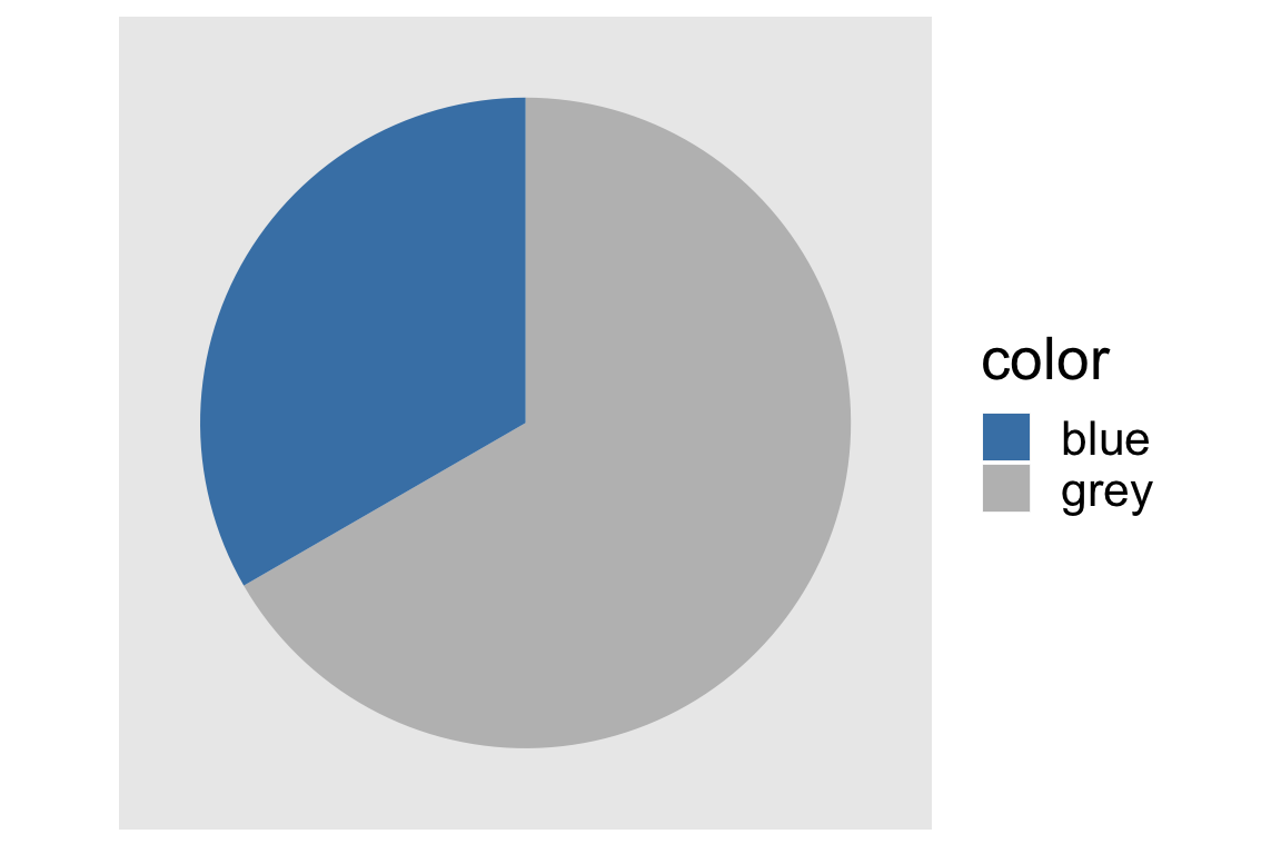
Don’t just take my word for it, even the help function in base R for pie charts (?pie) not so subtly suggests that they are terrible: ‘Pie charts are a very bad way of displaying information…’. I’ve never seen so much shade thrown in a help function before (if you have other examples I’d love to see them, really!). But why is there so much disdain for these perfectly circular representations of data? Primarily, there is a belief (that is, yes, backed up by some empirical results) that it is difficult to assess the magnitude of the difference in size between slices of the pie chart compared with other more ‘linearly-interpretable’ visualizations such as histograms, column charts, scatter plots, etc. However, humans are actually pretty good at understanding pie charts with exactly two partitions. When we move to three or more segments we start to have a difficult time evaluating the relative sizes of each slice.

Understanding others’ and (especially) our own biases and areas where we can better represent data is extremely important for everyone who displays or consumes data (AKA citizens of the world above age 16 save those in the clergy and possibly Guy Fieri). As such, I decided to create a small shiny app which can help us illustrate the impact visualization choice has on our understanding of data. The app simply displays random data in column and pie charts, asking the user to guess the relative size difference between two categories. By showing the difficulty of doing so, we will come away with a better/deeper understanding of these types of visualizations’ interpretations and their shortcomings, as well as a neat method of testing the effectiveness of data representations.
Side notes:
1.) When users hit the ‘submit’ button on the Shiny app, the guess and relative frequencies will be stored. That’s it though, no ip address, location data, etc. :)
2.) Once we get a few dozen responses I will open source the results in case anyone is interested in playing with these data!
3.) As of 2019-01-17 I am hosting the shiny app on the free RStudio server, too much traffic may cause it to be slow or crash. Feel free to fork, make changes, or just run yourself! The repo is here.
4.) The app can be found on github here